Published


A New Look for Long Angle
A New Look for Long Angle
Long Angle has a new look. Learn why we evolved from the original tree to a compass, and how our broader visual identity reflects the direction, perspective and community members find here.
You may have noticed things look a little different around here.
Long Angle has grown quite a bit since we started. Our community has grown, what we offer has grown, and the ways members interact with Long Angle have grown too.
Our old identity, however, hadn't quite kept up.
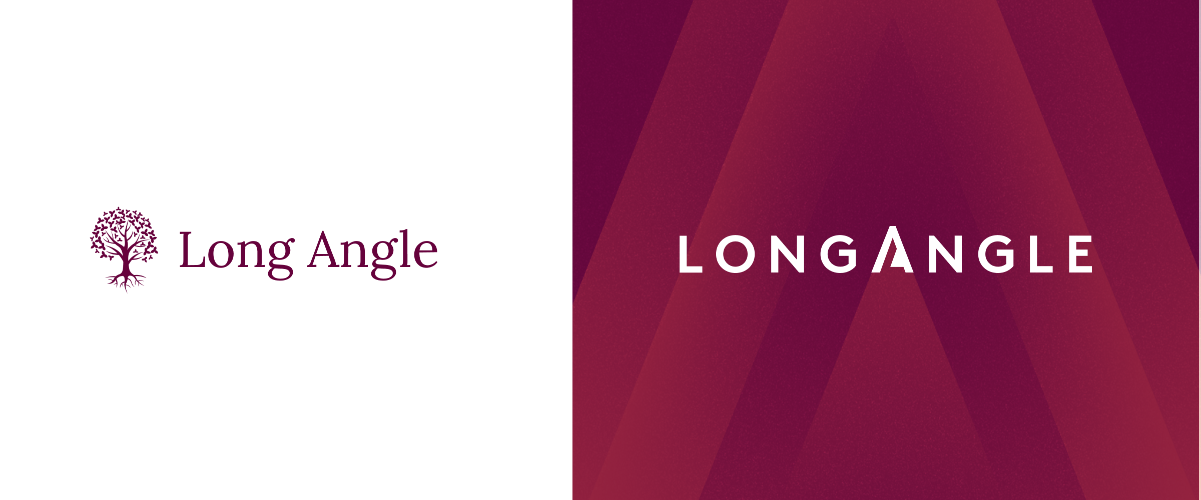
We have a lot of affection for the original tree. It represented growth and community, and served us well in our early years. But, if we're being honest, it was becoming a little difficult to live with. It was complicated, didn't particularly enjoy being shrunk down to the size of an app icon, and trees, it turns out, are fairly popular logos.
There was another problem. The tree and the Long Angle name never really had much to do with each other. Put them together and they always felt like two separate ideas sharing the same space.
So this time, we wanted the mark and the name to work together.
The Compass
Our new compass is built directly into the Long Angle wordmark, turning the "A" into a simple directional mark that can also stand on its own. It's a small detail, but it gives the identity a much stronger connection to who we are and what we do.
And that idea of direction felt right.
Long Angle isn't simply about growth. At its best, this community helps members make better decisions. You get perspective from people who've faced similar questions, challenge your own thinking, and use that collective insight to find the path that's right for you.
The compass represents that idea: clear, practical direction when the right answer isn't always obvious.
More than a new logo
One thing we learned pretty quickly was that changing the logo wasn't enough.
Over the years we'd accumulated colours, type styles, layouts and one-off solutions without much of a system connecting them. So we've created a broader visual language designed to make everything feel consistent and recognisably Long Angle, wherever you encounter it.
Not everything changed, though. The Tyrian purple carried straight over.
It was the part of the old identity that was already doing its job. Everything else got rebuilt around it. New mark, new type, same colour you already associate with us.
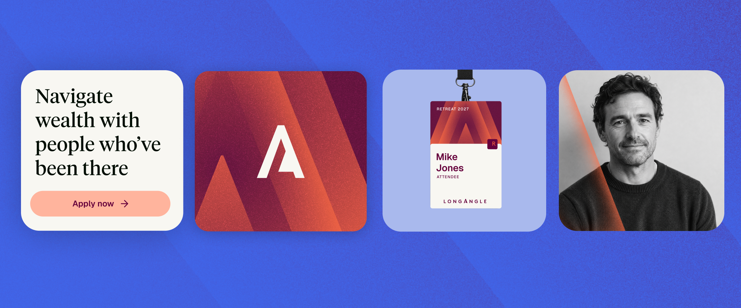
You'll already see some of that on our new website and in our emails. Over time we'll bring more of the new visual language into the Long Angle platform itself.
And if you're joining us at the Retreat, you'll see a lot more of it there too.
The tree had a good run. We're excited to see where the compass takes us.
More From Long Angle
Beyond Wealth Newsletter
Navigating Wealth Podcast
Research & Studies
Alternative Investment Education
Blog